The most trusted image in bioacoustics is also the most misunderstood
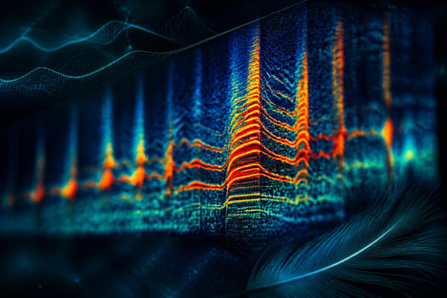
Open any paper on animal sound and you will find spectrograms — those heat-map images with time running left to right, frequency bottom to top, and brightness showing energy. They feel like photographs of sound: neutral, complete, true. They are not. A spectrogram is a reconstruction, and every reconstruction is built from assumptions. If you don't know the assumptions, you will confidently misread the picture.
This matters for WAVE because the spectrogram is where a human and a model meet. The model produces a prediction; the researcher checks it against the picture. If the picture is lying — or rather, if it's telling a partial truth you mistake for the whole — the check fails silently.
Time versus frequency: the trade you can't escape
The core of a spectrogram is the Short-Time Fourier Transform (STFT). You slide a window across the waveform and, for each position, ask "what frequencies are present right now?" The catch is the word window. To know a frequency precisely, you need to observe many cycles of it — a long window. But a long window smears time: you can no longer say exactly when something happened. Shorten the window to pin down timing, and frequency turns to mush.
This is not an engineering limitation to be optimized away. It is a mathematical law — the same uncertainty principle that shows up in quantum mechanics. You cannot have arbitrarily sharp time and arbitrarily sharp frequency at once. Every spectrogram you have ever seen sits somewhere on that trade-off, and someone chose where.
- Wide window (narrowband): beautiful frequency resolution, great for tonal calls like whale moans; blurry on timing.
- Narrow window (wideband): crisp timing, great for clicks and rapid trills; frequency bands look thick and fuzzy.
Show the same dolphin recording with two window settings and you get two different-looking animals. Neither is wrong. Both are incomplete.
Why WAVE leans on the Superlet Transform
The window trade-off is especially punishing for animal sound, because animals refuse to be convenient. A single humpback phrase can contain a low, sustained moan and a sharp pulsed knock within the same second. Pick a window that flatters the moan and you blur the knock; pick one for the knock and the moan loses definition.
The Superlet Transform — a technique adapted from neuroscience, where it was developed to resolve fast, transient brain oscillations — sidesteps the single-window compromise. Instead of committing to one resolution, it combines a set of wavelets of increasing bandwidth and takes their geometric mean. The effect is a representation that stays sharp in both time and frequency across a wide range at once. It is how WAVE's analysis showed that the Chagos pygmy blue whale song is pulsed rather than continuous — a structural detail that a conventional spectrogram, forced into one window, tends to wash out.
The lesson is not "Superlets are magic." It's that the representation is a scientific instrument with a resolution spec, and choosing the right one is part of the experiment — not a cosmetic step before the real work.
The things a spectrogram quietly drops
Beyond the time-frequency trade, spectrograms discard information you may care about:
- Phase. The STFT keeps magnitude (how much energy) and usually throws away phase (the timing relationship between frequency components). For many questions that's fine. For fine-scale structure and for reconstructing or comparing waveforms, phase can matter.
- Amplitude nuance. Brightness is usually shown on a logarithmic (dB) scale, which compresses loud and quiet into a viewable range but distorts your sense of proportion. A band that looks "twice as bright" is not twice as energetic.
- Below the noise floor. Anything quieter than the ambient noise simply isn't visible. A faint, distant call in a noisy ocean can be present in the water and absent from the picture.
None of this makes spectrograms bad. It makes them instruments with a manual — and most people never read the manual.
How to read one without fooling yourself
A few habits separate careful analysts from confident ones:
1. Always know the settings. Window length, overlap, FFT size, frequency scale (linear vs. log vs. mel), and dynamic range. If a figure doesn't report them, treat its fine detail with suspicion.
2. Look at more than one view. If a feature survives across window choices, it's probably real. If it appears in one setting and vanishes in another, it may be an artifact of the transform.
3. Distrust perfectly straight lines and perfect grids. Electrical hum, recorder artifacts, and aliasing produce suspiciously regular features that biology rarely makes.
4. Trust your ears as a second instrument. Human hearing evolved to segregate overlapping sounds. If the picture says one thing and the audio says another, both deserve another look.
Where the model fits
Machine-learning classifiers like BirdNET don't "look at" spectrograms the way you do, but they are trained on them — which means they inherit the same representational choices. A model trained on one spectrogram configuration can degrade on audio processed differently: a different sample rate, a different window, a different noise profile. This is one quiet reason a bird-trained model stumbles on marine audio: not only is the species out of distribution, so is the picture.
WAVE's design takes this seriously. When you upload a clip, it is resampled to the rate the model expects before analysis, so the model sees the representation it was trained on. And when WAVE shows you a spectrogram alongside a prediction, the point is not decoration — it's to give you, the human, the second instrument you need to sanity-check the machine.
The honest takeaway
A spectrogram is one of the most useful tools in all of bioacoustics, and one of the easiest to over-trust. It is not a photograph of sound; it is an argument about sound, built from specific choices about time, frequency, amplitude, and what to discard. Learn the choices and the picture becomes a precision instrument. Ignore them and it becomes a very convincing way to be wrong.
At WAVE we'd rather hand you an instrument you understand than a picture you believe. The difference sounds academic until the moment a prediction and a spectrogram disagree — and one of them is right.
Mel, linear, and log: the axis you rarely question
Even the frequency axis is a choice. A linear scale gives equal space to every hertz, which spreads out high frequencies and crushes the low ones where a lot of animal energy lives. A logarithmic scale mirrors how we perceive pitch — each octave gets equal space — and often reveals harmonic structure more clearly. The mel scale, borrowed from human speech research, warps frequency to match human perception and underpins many machine-learning pipelines.
Here's the subtle danger: a model trained on mel-scaled spectrograms has, in effect, been taught to see the world through a human-hearing lens. That's fine for birds, whose vocalizations overlap our hearing range. It is less obviously fine for infrasonic elephant rumbles or ultrasonic bat calls, where the interesting structure may sit in regions the mel scale de-emphasizes. The representation encodes an assumption about whose ears matter, and that assumption doesn't always fit the animal.
A worked intuition: the same second, three ways
Imagine one second of a dolphin recording containing a whistle (tonal, sweeping up in pitch) and a burst of echolocation clicks (sharp, broadband, rapid).
- On a narrowband spectrogram, the whistle is a clean, elegant curve — and the clicks smear into a vertical haze.
- On a wideband spectrogram, the clicks resolve into a crisp sequence of vertical ticks — and the whistle thickens into a fuzzy ribbon.
- With a Superlet representation, both stay legible: the curve keeps its shape, the clicks keep their timing.
No single conventional picture is the truth. The animal made one sound; the instrument decided which parts you'd see clearly.
Practical settings that actually matter
If you take away one operational habit, make it this: before trusting fine detail in any spectrogram, know four numbers.
1. Window length — sets your time/frequency balance.
2. Overlap — how much consecutive windows share; higher overlap smooths the image but can imply more time precision than exists.
3. FFT size — the number of frequency bins; larger isn't automatically better, it just interpolates.
4. Dynamic range (dB floor) — how much of the quiet end you're showing; a generous floor reveals faint calls but also more noise.
Change any of these and the "same" recording can look meaningfully different. That's not a bug to be embarrassed about. It's the nature of turning a one-dimensional wiggle in air or water into a two-dimensional picture your eyes can parse.
One last habit
Whenever a spectrogram surprises you, change a setting and look again. If the surprising feature survives, believe it a little more; if it vanishes, you've learned it was partly the instrument talking, not the animal. That single reflex — never trust a picture you've only seen at one resolution — will save you from most of the ways a spectrogram can quietly mislead. It costs seconds and it buys the difference between reading a signal and inventing one, which is the entire game.